The Geography of Upward Mobility in America
The differences in upward mobility across areas are caused by differences in childhood environment. Studying the experiences of seven million children who moved across areas while growing up, we document that every year of exposure to a better environment improves a child’s chances of success.
Gain from Moving to a Better Neighborhood
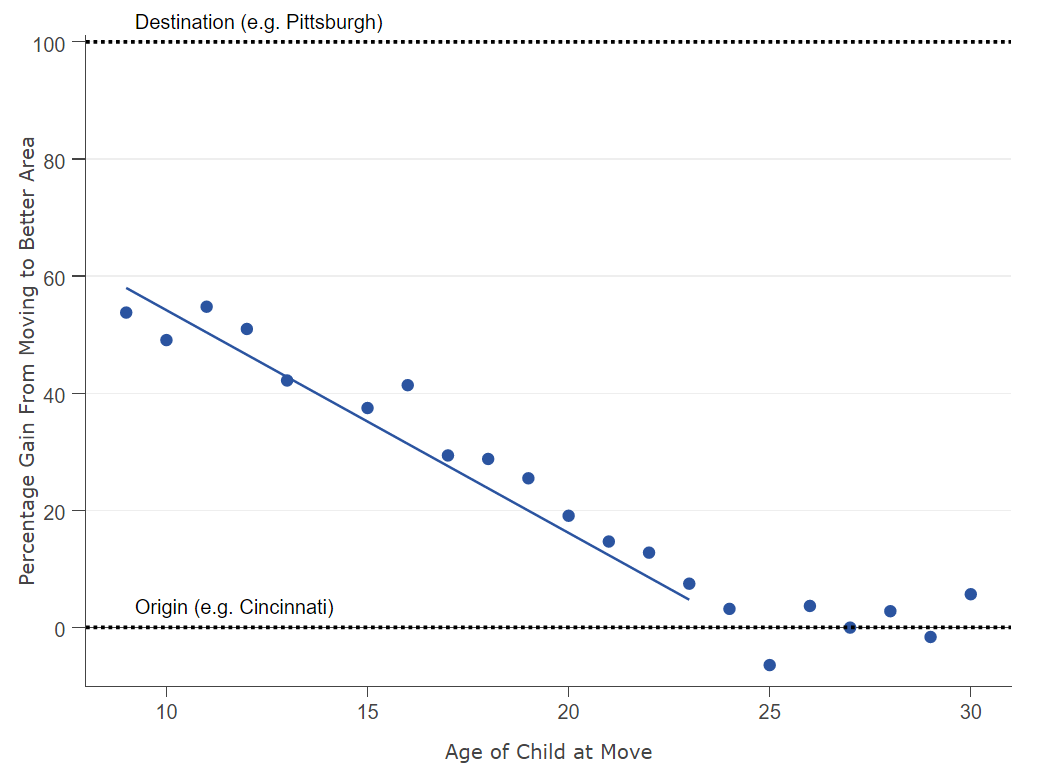
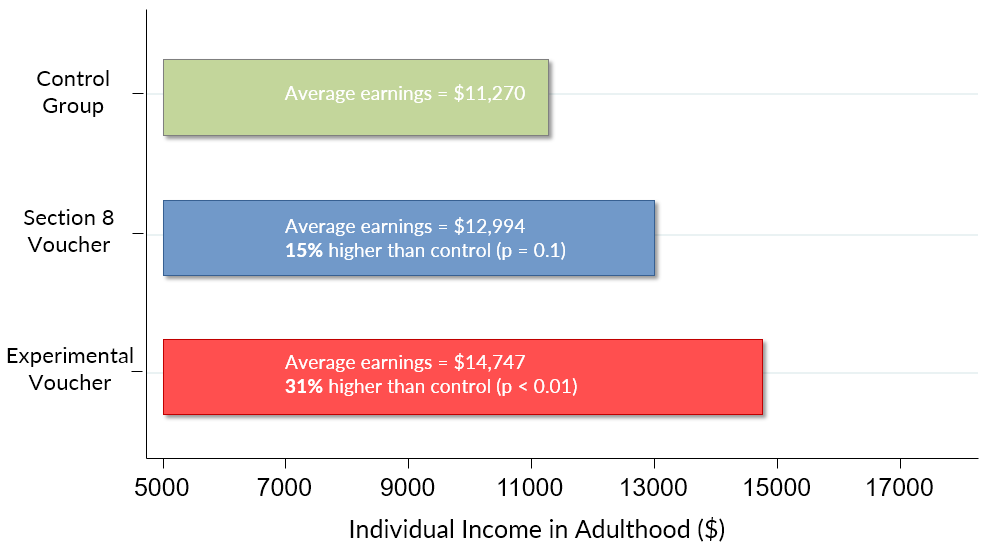
Can policies that improve children's neighborhood environment improve their outcomes in adulthood? The Moving to Opportunity experiment gave vouchers to low-income families to move to better neighborhoods and led to substantial increases in children’s earnings as adults, increases in college attendance, and reductions in out-of-wedlock births.
Cost Effective Policy
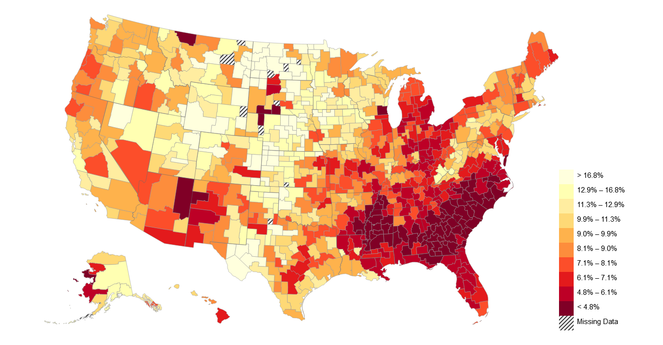
Where are the best places to grow up? Chetty and Hendren (2016) estimate the causal effect of growing up in each county in the US. The table below shows the percentage gain (or loss) in income from growing up in each of the 100 largest commuting zones (metro areas) or counties in the U.S. for children in low-income families (25th percentile).
Local Area Rankings
| Rank | Commuting Zone | State | All Kids | Boys | Girls |
|---|---|---|---|---|---|
| Seattle | Washington | 11.6% | 9.1% | 14.2% | |
| Minneapolis | Minnesota | 9.7% | 9.2% | 10.1% | |
| Salt Lake City | Utah | 9.2% | 3.6% | 15.3% | |
| Reading | Pennsylvania | 9.1% | 8.4% | 9.7% | |
| Madison | Wisconsin | 7.4% | 10.4% | 3.9% | |
| Des Moines | Iowa | 6.6% | 4.7% | 8.5% | |
| Omaha | Nebraska | 6.4% | 5% | 7.8% | |
| Washington DC | District Of Columbia | 5.8% | 4.7% | 7.1% | |
| Spokane | Washington | 5.6% | 8.1% | 2.7% | |
| Portland | Oregon | 5.2% | 7.6% | 2.6% | |
| Bakersfield | California | 4.7% | 7% | 2.2% | |
| Harrisburg | Pennsylvania | 4.6% | 5.4% | 3.6% | |
| Syracuse | New York | 4.5% | 7.9% | 0.6% | |
| Canton | Ohio | 4.2% | 8% | 0% | |
| Fort Worth | Texas | 3.7% | 5.8% | 1.4% | |
| Las Vegas | Nevada | 3.7% | -1.7% | 9.6% | |
| Portland | Maine | 3.7% | 6.5% | 0.6% | |
| San Diego | California | 3.3% | 1.1% | 5.7% | |
| Erie | Pennsylvania | 3.3% | 6.5% | -0.3% | |
| Tulsa | Oklahoma | 3.3% | 3.7% | 2.8% | |
| Toms River | New Jersey | 2.9% | -1.1% | 7.4% | |
| Honolulu | Hawaii | 2.9% | 2% | 3.8% | |
| Santa Barbara | California | 2.7% | 0% | 5.5% | |
| San Francisco | California | 2.5% | -0.3% | 5.6% | |
| Pittsburgh | Pennsylvania | 2.1% | -0.1% | 4.6% | |
| Boston | Massachusetts | 2.1% | 3.3% | 0.8% | |
| San Jose | California | 1.9% | -7.6% | 12.4% | |
| Manchester | New Hampshire | 1.6% | 3.7% | -0.7% | |
| Denver | Colorado | 1.3% | 2.1% | 0.5% | |
| Allentown | Pennsylvania | 1.3% | -2.2% | 5.1% | |
| Brownsville | Texas | 1.2% | 2.6% | -0.3% | |
| Santa Rosa | California | 1.1% | 0% | 2.3% | |
| Eugene | Oregon | 1% | 2.9% | -1% | |
| Oklahoma City | Oklahoma | 1% | 0% | 2.2% | |
| Phoenix | Arizona | 0.7% | -3.2% | 5% | |
| Modesto | California | 0.6% | -2% | 3.4% | |
| Cleveland | Ohio | 0.5% | 5.7% | -5.1% | |
| Sacramento | California | -0.2% | -4.5% | 4.6% | |
| Providence | Rhode Island | -0.3% | -0.1% | -0.5% | |
| Newark | New Jersey | -0.3% | 2.3% | -3.2% | |
| Little Rock | Arkansas | -0.4% | 6.7% | -8.1% | |
| Buffalo | New York | -0.5% | -0.5% | -0.4% | |
| Scranton | Pennsylvania | -0.5% | -4.2% | 3.6% | |
| Gary | Indiana | -1% | 5.5% | -8.2% | |
| El Paso | Texas | -1.4% | 0.9% | -3.9% | |
| Grand Rapids | Michigan | -1.4% | 0.2% | -3.2% | |
| Louisville | Kentucky | -1.7% | 1.4% | -5% | |
| Kansas City | Missouri | -1.7% | -2.5% | -0.8% | |
| Columbus | Ohio | -1.8% | 3.6% | -7.7% | |
| Philadelphia | Pennsylvania | -2% | -5.2% | 1.6% | |
| Springfield | Massachusetts | -2.2% | -0.8% | -3.6% | |
| Albany | New York | -2.3% | 2.9% | -7.9% | |
| Cincinnati | Ohio | -2.3% | -0.1% | -4.7% | |
| Jacksonville | Florida | -2.6% | 1.9% | -7.5% | |
| Dallas | Texas | -2.7% | -8.7% | 3.9% | |
| Miami | Florida | -2.8% | -6.1% | 0.9% | |
| Houston | Texas | -2.8% | -5.6% | 0.3% | |
| Toledo | Ohio | -2.9% | -1.8% | -4% | |
| Youngstown | Ohio | -3.2% | 2.8% | -9.9% | |
| Rockford | Illinois | -3.5% | -4.3% | -2.5% | |
| Dayton | Ohio | -3.7% | -4.3% | -2.9% | |
| Lakeland | Florida | -4.1% | -5.1% | -3% | |
| Austin | Texas | -4.3% | -4.3% | -4.2% | |
| Bridgeport | Connecticut | -4.6% | -6.8% | -2.1% | |
| Knoxville | Tennessee | -5% | -1.6% | -8.8% | |
| St. Louis | Missouri | -5% | -3.6% | -6.5% | |
| Milwaukee | Wisconsin | -5.4% | -6.8% | -3.9% | |
| Nashville | Tennessee | -5.5% | -3.4% | -7.7% | |
| South Bend | Indiana | -5.6% | -3.6% | -7.6% | |
| Richmond | Virginia | -5.8% | -4.8% | -6.7% | |
| Mobile | Alabama | -6.5% | -6.3% | -6.6% | |
| Indianapolis | Indiana | -6.6% | -3.1% | -10.4% | |
| Cape Coral | Florida | -6.8% | -14.7% | 1.9% | |
| Albuquerque | New Mexico | -7% | -11% | -2.7% | |
| Sarasota | Florida | -7.2% | -9.1% | -5% | |
| Tampa | Florida | -7.4% | -10% | -4.4% | |
| Atlanta | Georgia | -8.1% | -7.9% | -8.2% | |
| Baltimore | Maryland | -8.2% | -14.3% | -1.4% | |
| Tucson | Arizona | -8.2% | -18.7% | 3.4% | |
| Poughkeepsie | New York | -8.2% | -8% | -8.4% | |
| Pensacola | Florida | -8.4% | -10.4% | -6.1% | |
| New York | New York | -9% | -8.2% | -9.9% | |
| Los Angeles | California | -9.2% | -12.3% | -5.8% | |
| Virginia Beach | Virginia | -9.4% | -14.3% | -4% | |
| Detroit | Michigan | -9.5% | -15.4% | -2.8% | |
| San Antonio | Texas | -9.7% | -10% | -9.2% | |
| Port St. Lucie | Florida | -9.9% | -15.3% | -3.7% | |
| Baton Rouge | Louisiana | -10.4% | -4.8% | -16.5% | |
| Birmingham | Alabama | -10.5% | -12.8% | -7.9% | |
| Chicago | Illinois | -11.1% | -14% | -7.7% | |
| Fresno | California | -11.1% | -14.5% | -7.2% | |
| Orlando | Florida | -11.4% | -13.4% | -9% | |
| Memphis | Tennessee | -11.6% | -11.1% | -12.1% | |
| Greenville | South Carolina | -12.2% | -12.7% | -11.5% | |
| Raleigh | North Carolina | -12.6% | -11.8% | -13.3% | |
| Columbia | South Carolina | -13.9% | -16.3% | -11% | |
| Charlotte | North Carolina | -14.4% | -11.3% | -17.5% | |
| Greensboro | North Carolina | -14.8% | -15.9% | -13.3% | |
| New Orleans | Louisiana | -14.8% | -11.1% | -18.6% | |
| Fayetteville | North Carolina | -17.8% | -17.8% | -17.6% |
Commuting Zones
Counties
For example, if a child were to grow up in the Seattle metro area instead of an average place, he/she would make about 12% more at age 26. The average level of household income at age 26 is $26,000, so this 12% gain translates to $3,120 of additional income.
How can we reverse the decline of the American Dream? Our research looks to cities where
children’s chances of moving up out poverty remain high. Cities with high levels of
upward mobility tend to have five characteristics: lower levels of residential segregation,
a larger middle class, stronger families, greater social capital, and higher quality public schools.
We continue to study what policies can promote upward mobility and
provide data to help others join in the effort to
revive the American Dream.